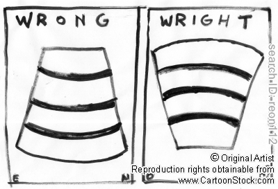
Design Analysis
When I was visiting New York in 2009, I went to the Guggenheim Museum that celebrated the golden anniversary of its landmark building with the exhibition Frank Lloyd Wright. And I think the poster design for that exhibition was really great. It definitely adheres to the principles of design: Simplicity, Clarity, and Consistency.
Solomon R. Guggenheim Museum, New York, New York, 1943–59, perspective. Ink and watercolor on art paper, 20 1/8 x 24 1/8 inches (51.1 x 61.3 cm). © 2009 The Frank Lloyd Wright Foundation. FLLW FDN #4305.745
The poster was made based on the Frank Lloyd Wright’s original drawing of the museum, and it not only provide all the information about the exhibition but also doesn’t distract the drawing at all.
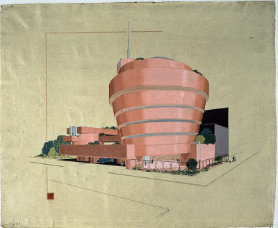
Original drawing
Underlying grid:
The poster's grid is based on the relationship between the drawing and the text. It is divided into three major equal vertical columns and symmetrical horizontal rows. The letters are positioned on the negative space of the drawing and the composition is really well-balanced.
Especially, the red perpendicular line started from the Wright's little square signature creates negative space and it made the drawing seemed well organized. In addition, it helps draw attention to the title which is the most important content in the poster.
Negative space:
The negative space envelops the center of the poster. By placing more space on the top, it makes the poster look more stable. Besides, the part that informs the 50 anniversary sticks out to the negative space, and it breaks the balance a little bit so that can avoid the poster to be boring and let people easily recognize the important message.
Typographic hierarchy:
The content of the poster is effectively delivered by using different font sizes and weights. Also, by using only white, black, and grey color for the text, it helps not to disrupt the colorful drawing while organizing the content from the title to the minor information. All colors of the poster seems desaturated and it made design more stable. The hierarchy allows people to easily find the important information and navigate the content. It also helps guide the reader’s eye from the left top to right bottom to where arranged in order of importance within the content.
The interesting thing is, It appears to be used only two different fonts which are from the single type face called Futura. Using one typeface makes the poster simple and consistent.
Even more interesting, I searched 'Futura' from Wikipedia by chance, it said, "Futura has an appearance of efficiency and forwardness. The typeface is derived from simple geometric forms... In designing Futura, Renner (Who designed the typeface) avoided the decorative, eliminating nonessential elements. "
I thought its description has definitely somthing in common with Wright's design, and this common factor leads the poster design to have more consistency.
Another great Guggenheim poster design

Chermayeff & Geismar Associates, New York, New York, 1975