
IKEA Logo Redesign
Logo Design | 2015
1. inspiration
IKEA is the one of my favorite brands as a student living in New York because of their pragmatic, simple design and reasonable price. I've been thinking that the logo could be more modernized, more like IKEA that reflects the positive brand image. Before I reworked the logo of IKEA, I looked into the corporate Identity so that I can keep the important design element that identifying the brand.
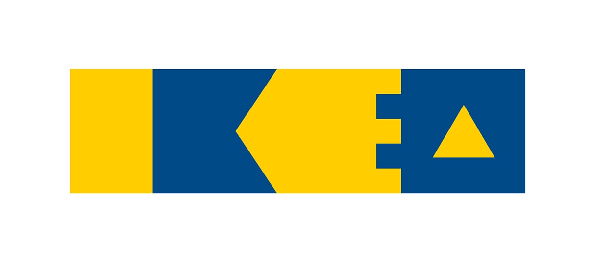
Design Elements of IKEA Logo
- Font & Color : The colors are blue (Pantone 293) and yellow (Pantone 109) which is the colors of the Swedish national flag. The boldness of the lettering (a Futura typeface) and the contrasting colors make the emblem really leap out. The blue color represents trust, and the yellow color depicts happiness, optimism and imagination.

I thought the most important elements are the colors and the boldness of the letting. I considered to keep the elements so that customer could sense the consistency in some way.
2. Idea sketch
I was trying to unitize each letter and connect the letters with each other in order to reflect the concept of its self-assembling products which is a critical feature of IKEA.

3. features
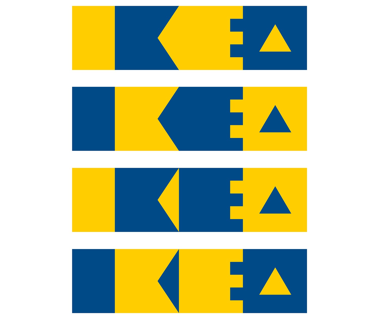
Final Result with Color variation
I keep the blue and yellow color by applying it to each letter by turns. Also I unitized each letter as square shape and simplified the letters by subtracting negative space. Lastly, I narrowed the width of letter "i" to make it balanced and more readable. I designed several types of logo with color variation.
4. pattern design
I made a pattern with the logo that has different color combinations. I thought it would be if I could expand the possibilities of using the logo for package design, etc.
