


Reimagining NYU Albert Interface
UX Design
During 'Designing meaningful interaction' class, I was ask to think of an object that is poorly designed and come up with a reimagined version of that object.
I chose NYU Albert which is the gateway to access in NYU's Student Information System. It is a website that all students visit very often and, as one of the users, I think Albert should be redesigned in terms of user experience.
The existing Albert pages
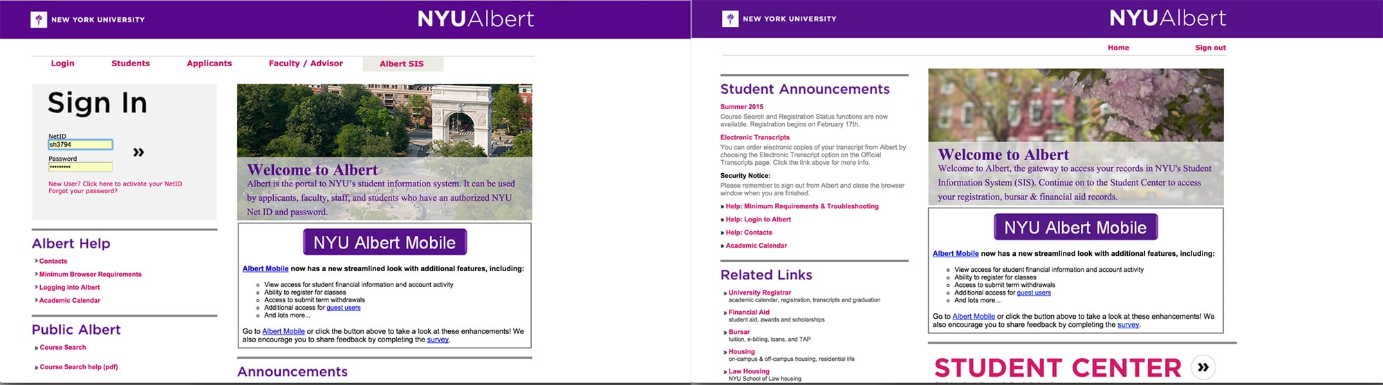
Homepage (Log in page) Landing page (after logging in)
Problems
- Even though users can access to most of the menus after logging in, it shows too many menus in log-in page.
- Most of the menus are duplicated in both log-in and the next page.
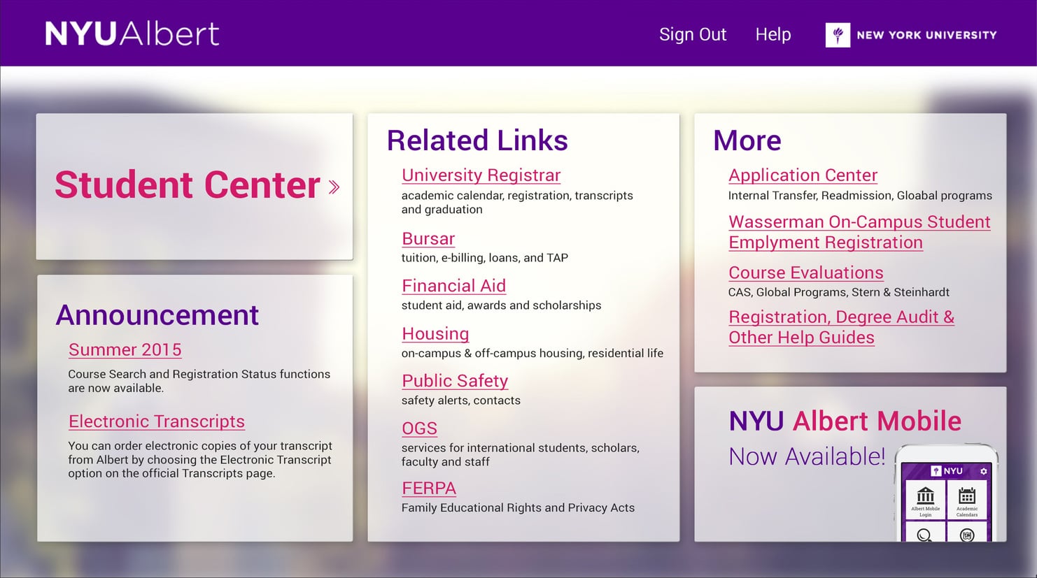
- There is no visual hierarchy in both pages. Log-in box should be pointed up among all the information in log-in page. Also, The menu named 'Student Center' showed after logging in is the biggest reason for students to visit Albert. However, users can barely see it since it is placed at the bottom of the page.
- It seems like they want to promote the information about Albert Mobile, apparently, however, it seems quite unnoticeable.
Information Architecture Ideation

Troubleshooting
- At first, I got rid of all the menus that require log-in in the first page and leave some information that supposed to be placed.
- Make the promotion for Albert mobile more visible by using graphic elements.
- After logging in, place 'Student Center' menu on the top, and make all menus grouped according to the categories.
Final Result
Homepage interface

Landing page interface


